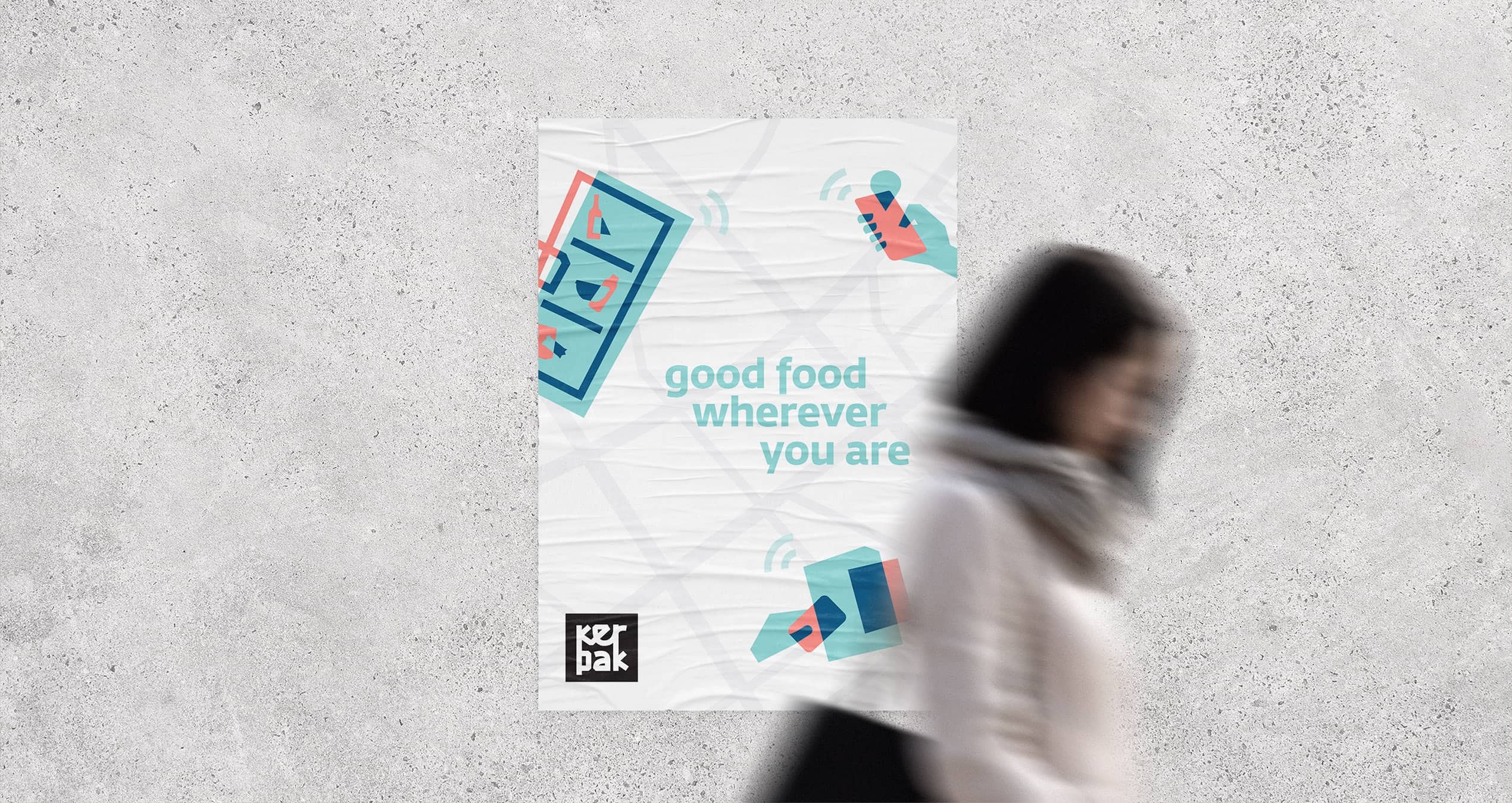
Kerpak - good food wherever you are
category /
Brand experience
client /
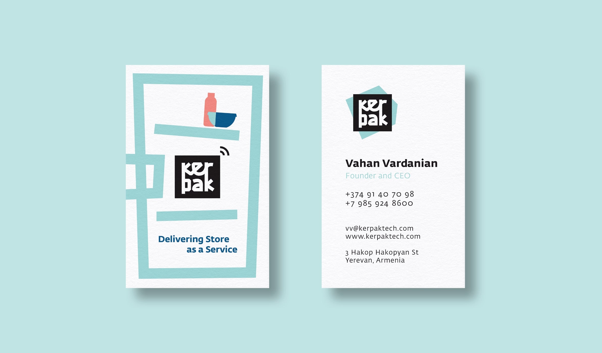
Kerpak
deliverables /
Brand identity and positioning
Visual identity
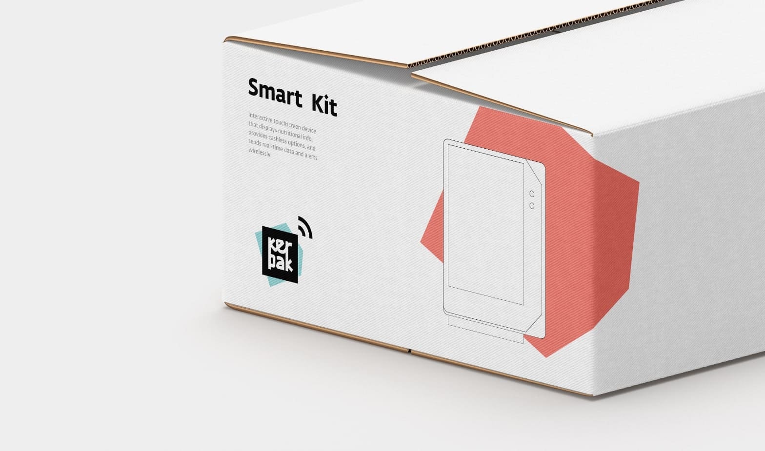
Packaging design
Packaging design
about the project
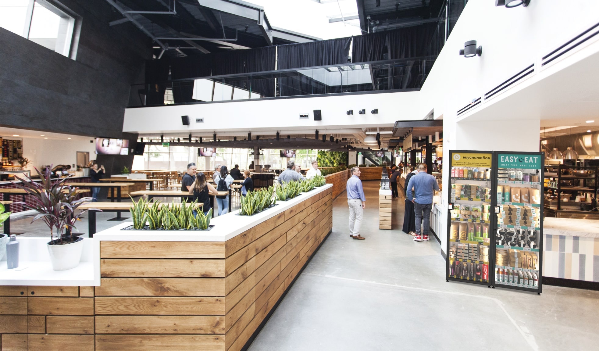
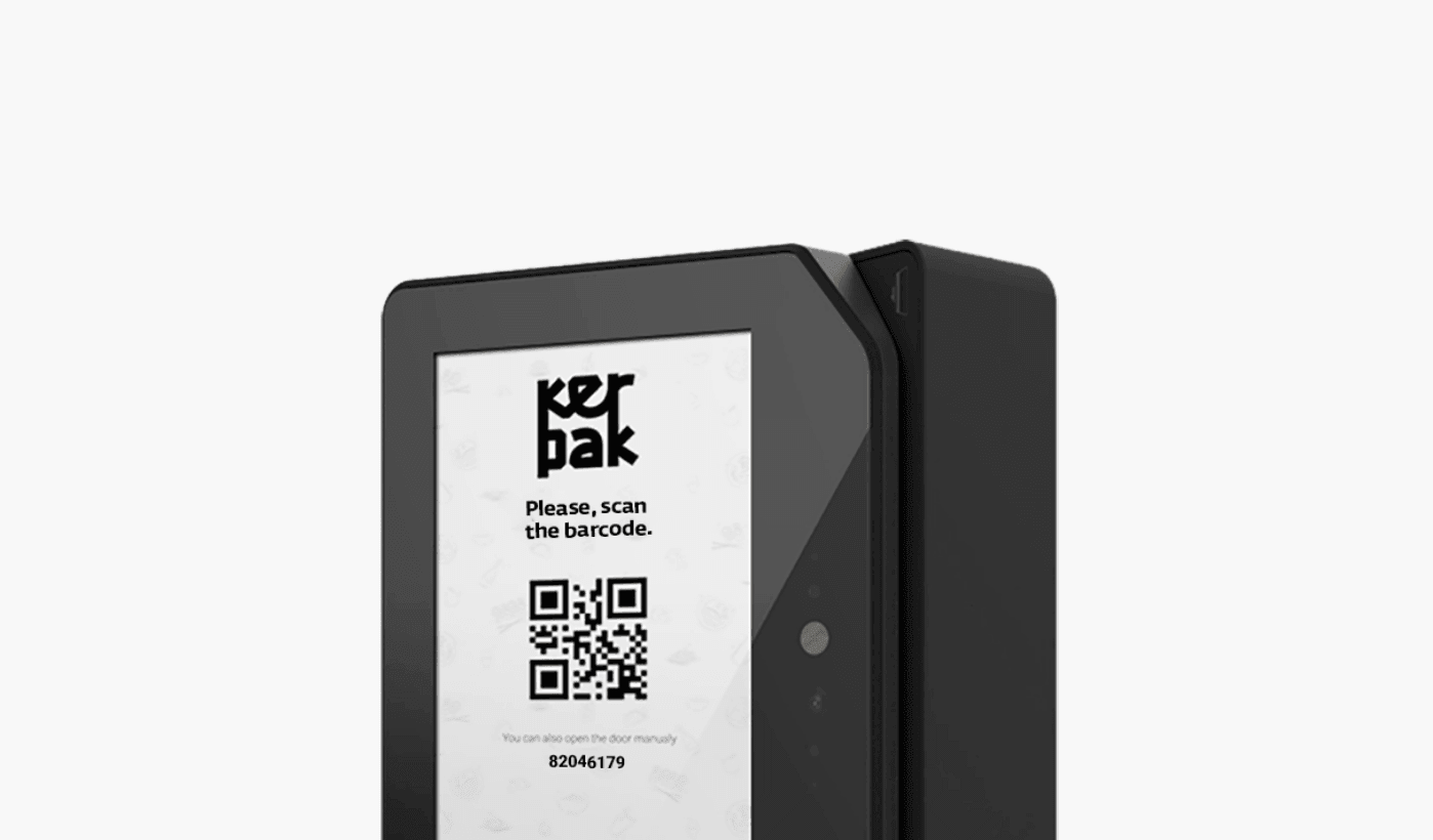
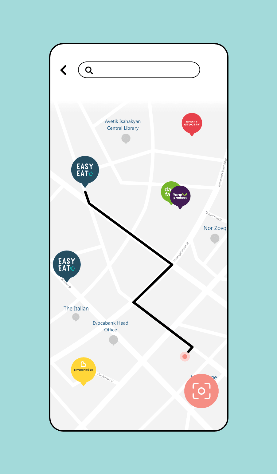
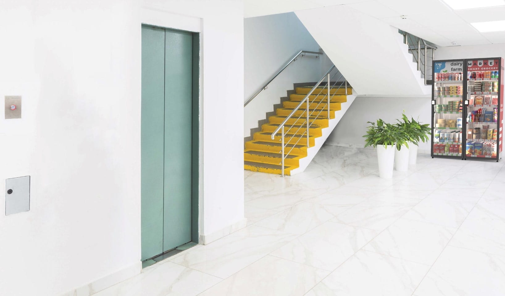
With a goal to disrupt outdated and expensive traditional vending machines. KerPak provides a brand-advanced, smoothly optimized experience for retailers. KerPak's smart refrigerators are an easy-to-install integrated shopping system for cafes, hotels, supermarkets, and all food producers of all sizes. Translated to Armenian, the name KerPak is derived from two words: food (ker) and pack (pak).


the result
Our designers illustrated WiFi lines on KerPak's logo, which indicates a communication symbol, as with the help of mobile application, one can find the fridges' locations anytime and anywhere. The logo itself looks like a map, which is pictured in a black square. In comparison with the logo, the fridge contains mixtures of turquoise, blue and pink colors, which gives a friendly look to the smart fridges.
team
Hovig, Art Director
Arpine, Account Manager
Sofia, Project Manager
Anna, Graphic Designer
Raf, Interactive Designer