Hexens - Novel Approach to Cybersecurity
category /
Brand experience
client /
Hexens
deliverables /
Brand identity and positioning
Research and brand strategy
Visual identity and motion design
Digital design
Brand guidelines
about the project
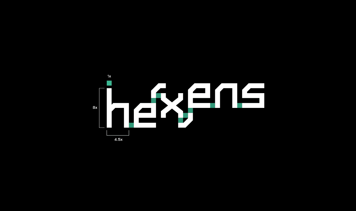
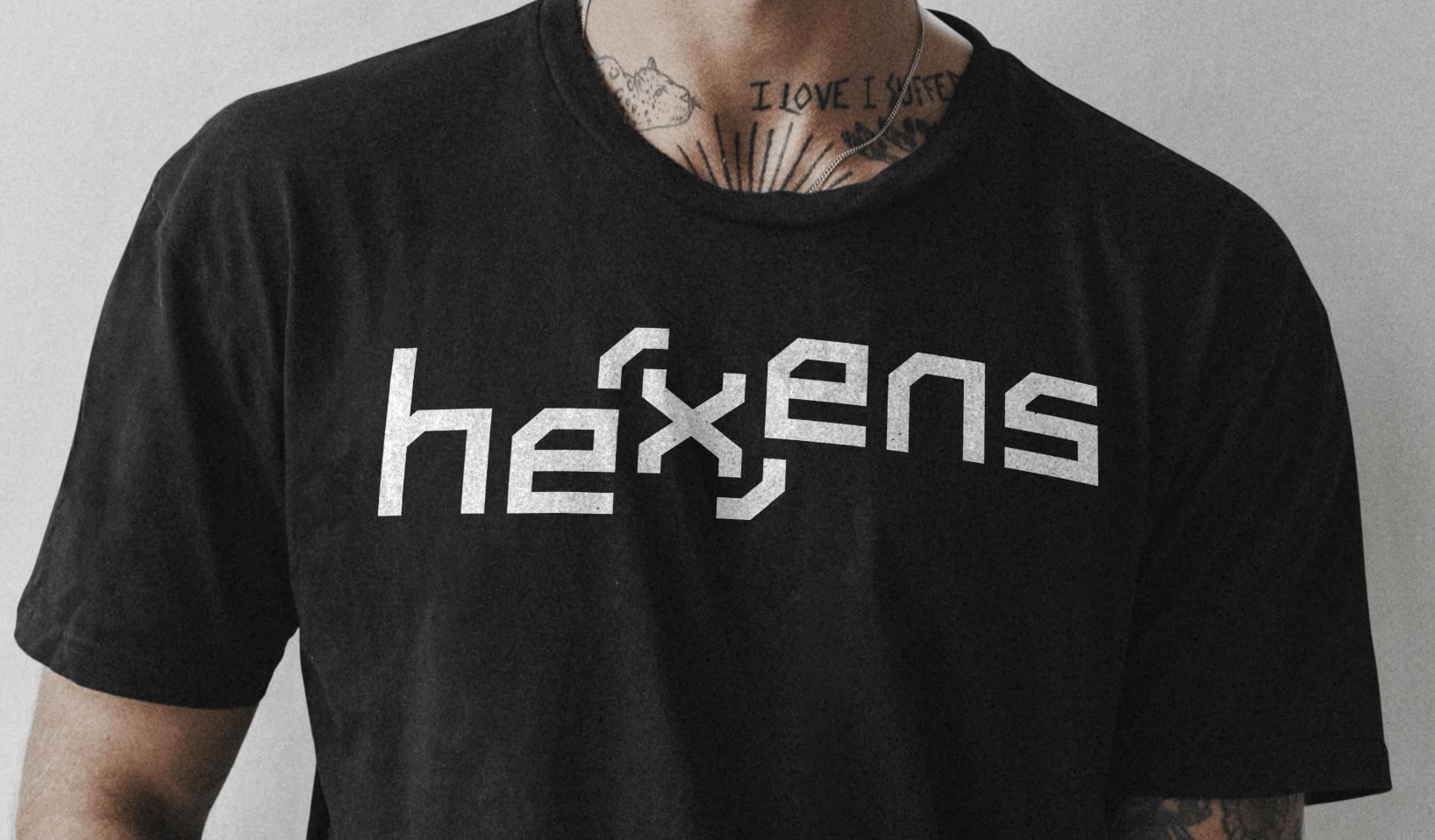
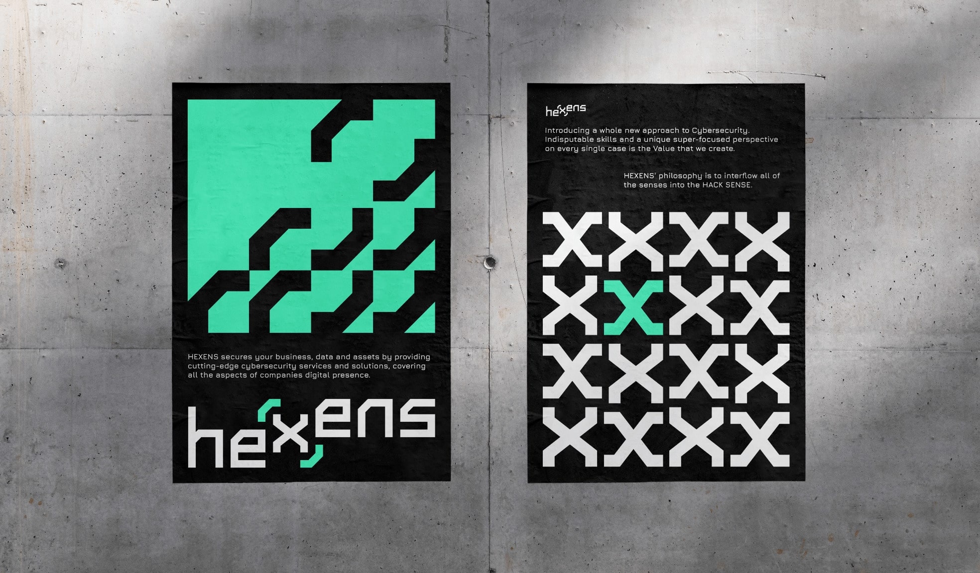
When the cybersecurity company Hexens reached out to us to freshen up their brand identity, we thought it would be a cool opportunity to showcase the inner matrix-fanboiis inside of us. Diving deep into our 90s cyberpunk alter egos, we decided to take inspiration from the name “HEXens” to both visualize the reference, while also bringing to life the company’s true value to its customers: applying the latest cybersecurity technology to provide secure data and assets for businesses.
Visit The Website
the result
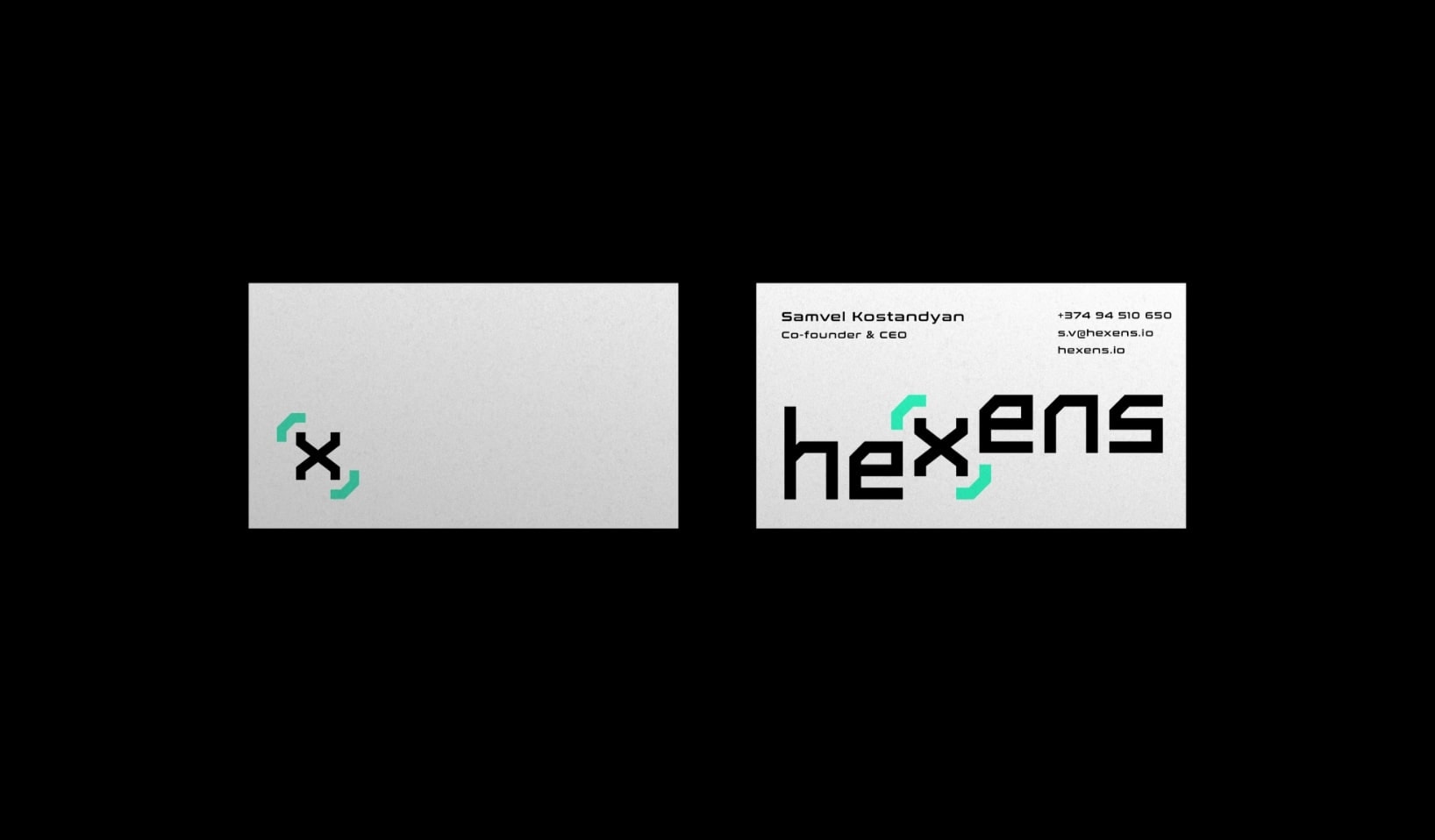
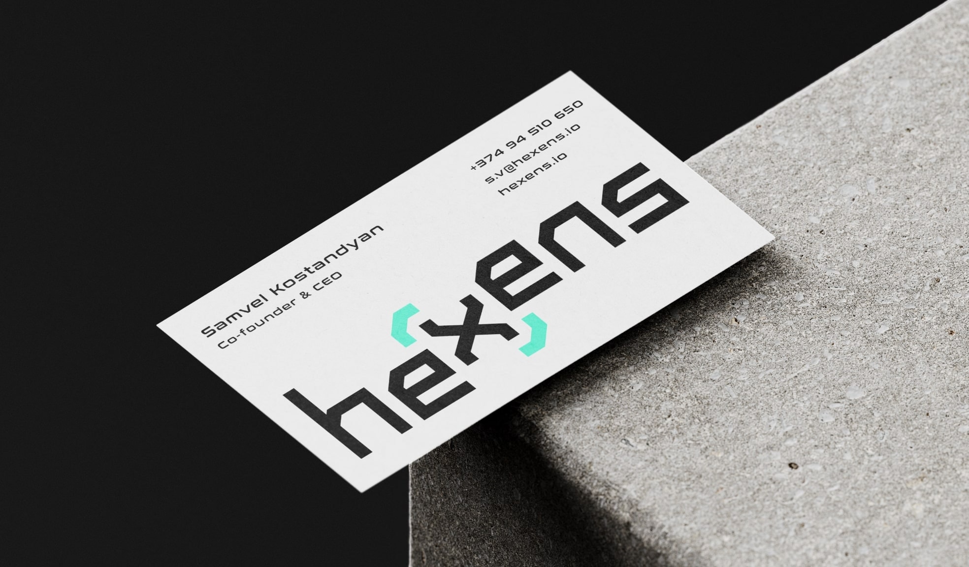
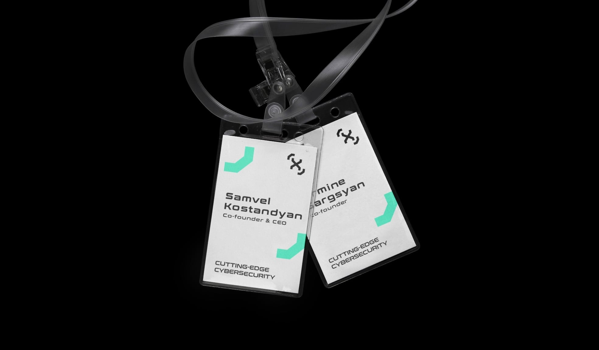
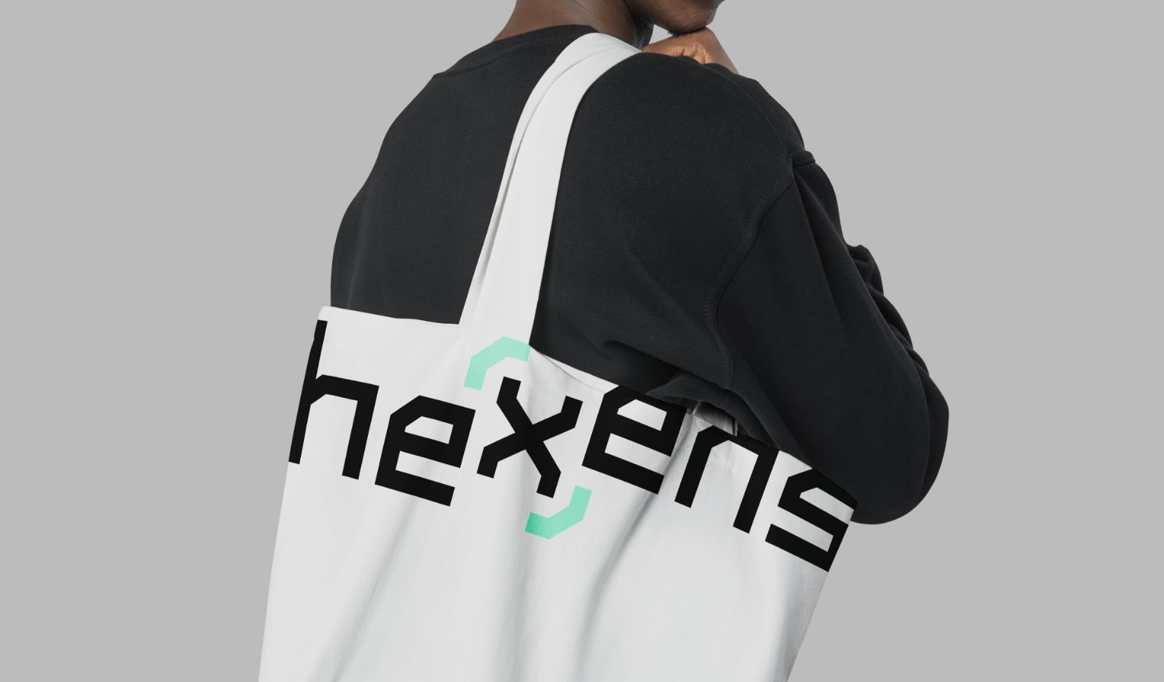
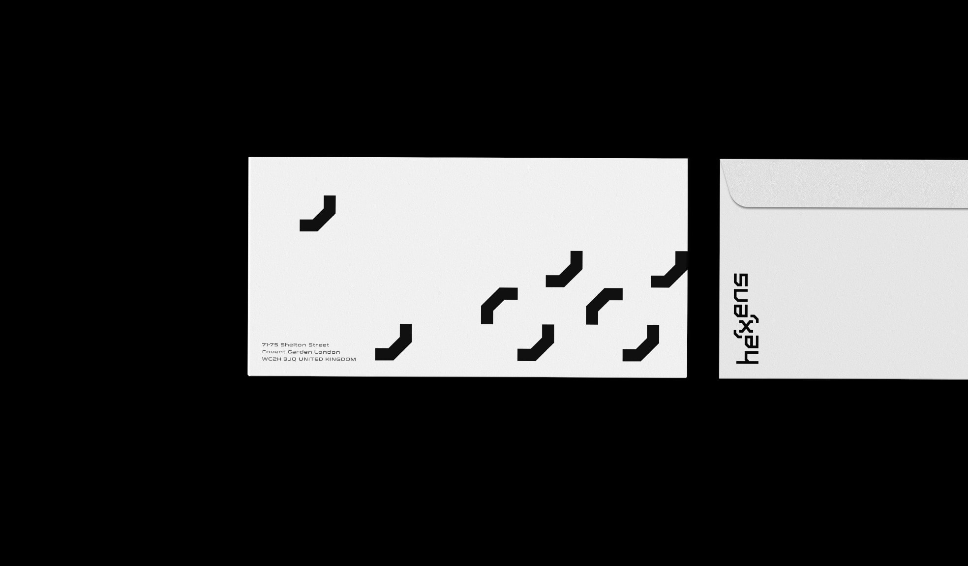
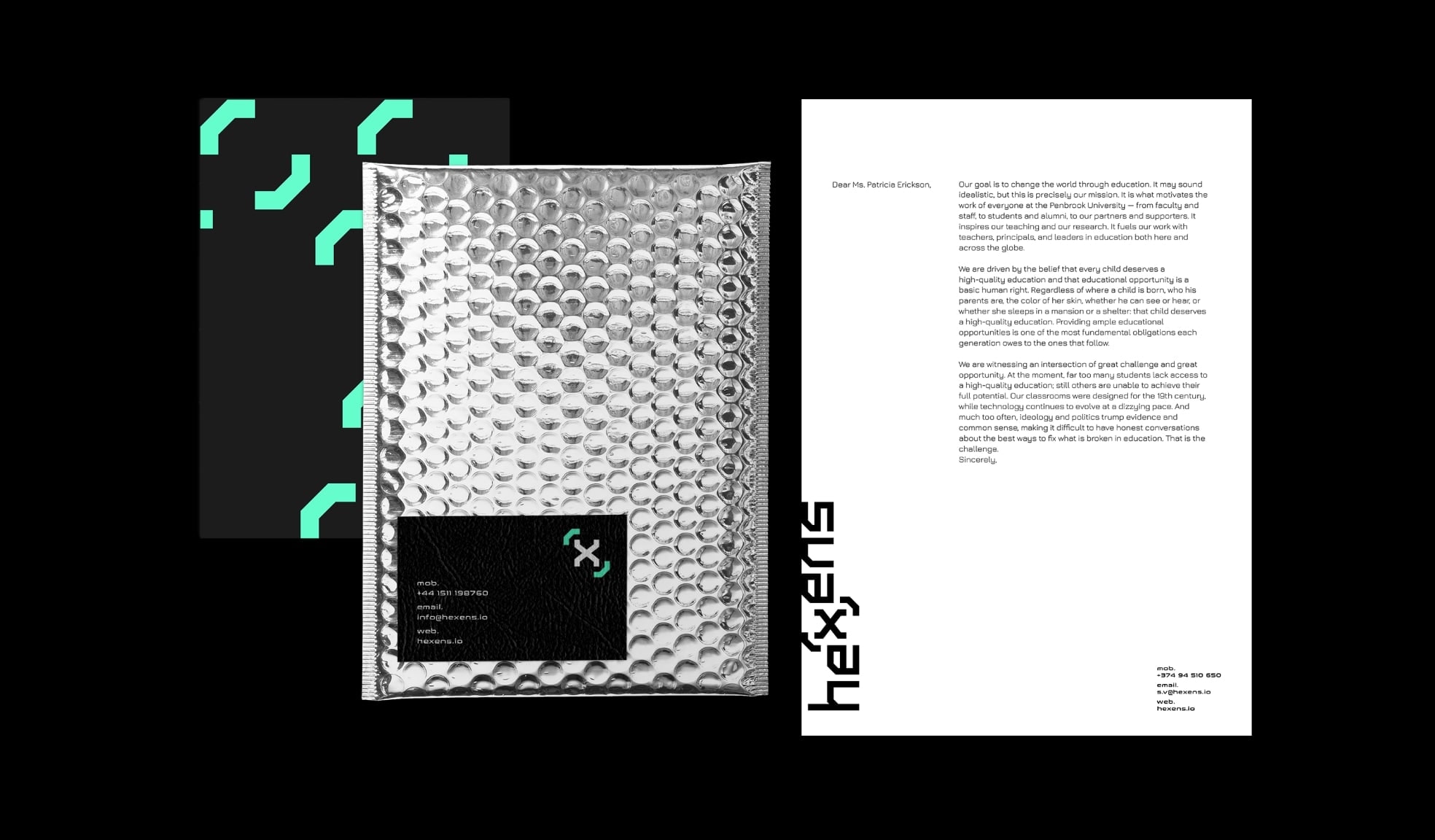
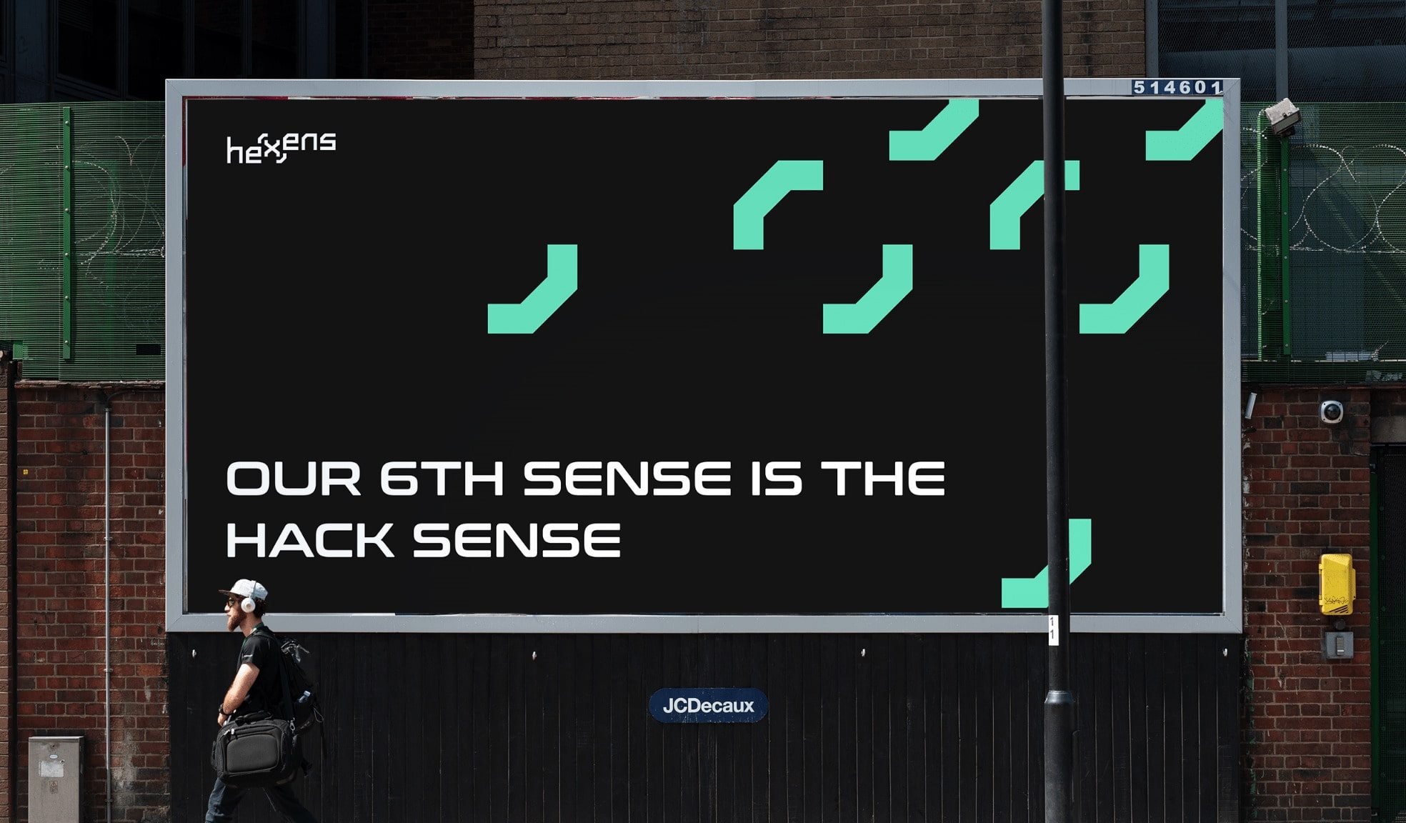
We used geometric patterns and shapes and combined them with a cool white over black font which really brings out the green in the centered X. This kind of logo would look really good flapping in the wind on Hexen employees’ black trench coats as they work tirelessly in their black sunglasses to fix their clients’ security needs. Beep Beepp brrrrrr beep beeeep (that’s the sound of us connecting to the Matrix).
team
Anginé, Creative Director
Mariam, Graphic Designer
Raf, Interaction Designer
Sofia, Project Manager


