Zoya's Pantry - Your one stop organic online store
category /
e-commerce
client /
Zoya's Pantry
deliverables /
Brand identity and positioning
Visual identity and motion design
Brand guidelines
UI/UX design
Prototyping
Website Development
about the project
Considering the more conservative approach to the brand, our team encountered various obstacles in the process of refreshing the digital presence of the company through creating a completely modern look and providing a new impulse for the digital presence of the company.
Visit The Website
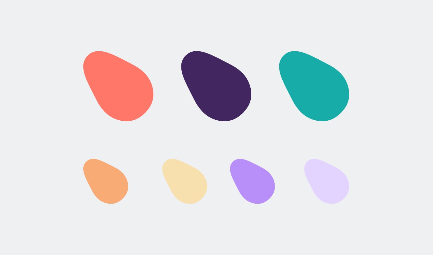
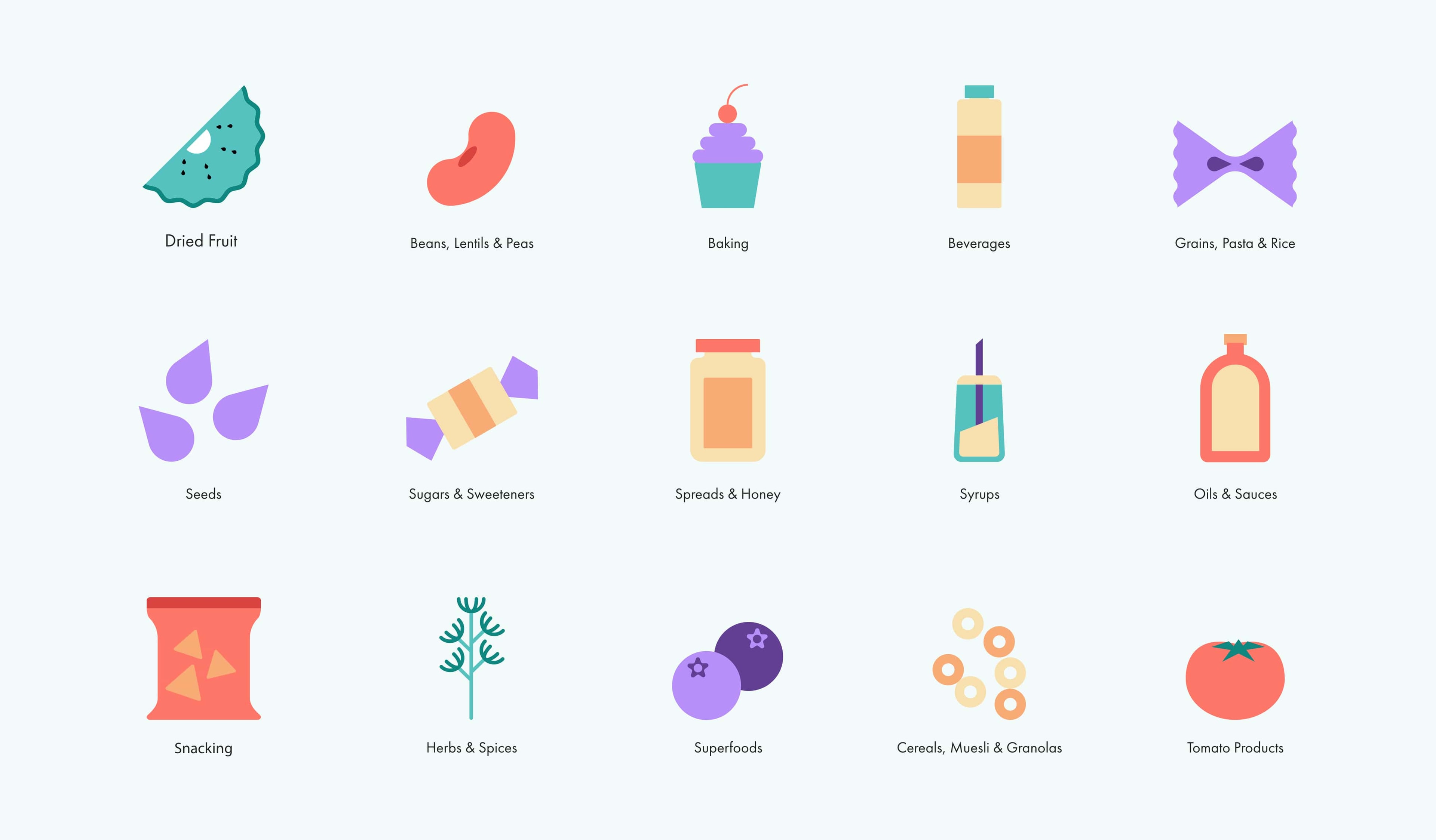






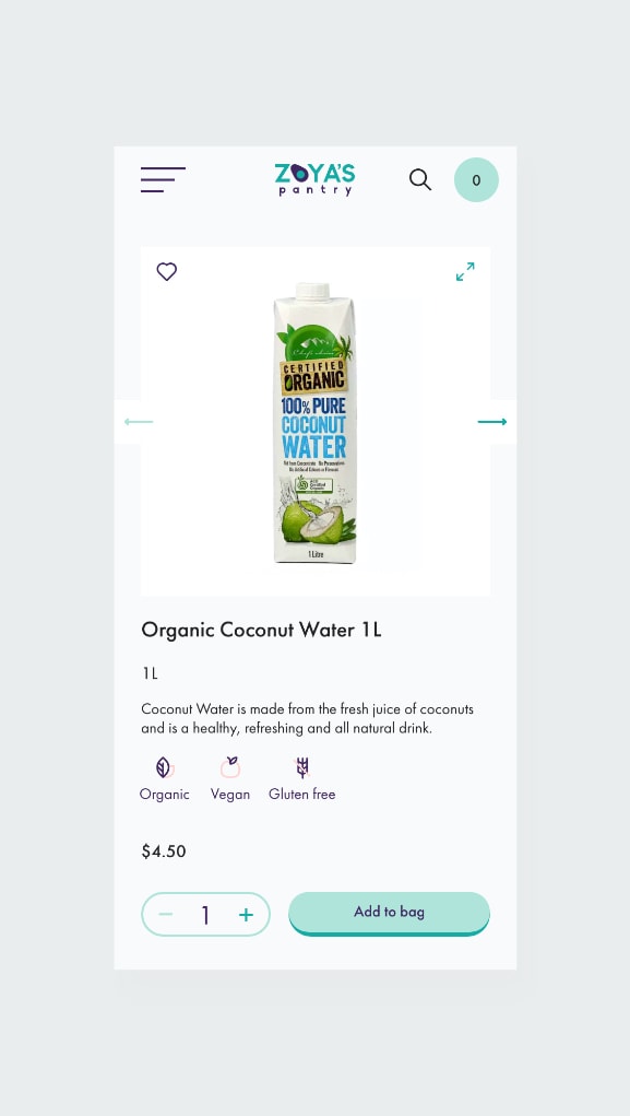

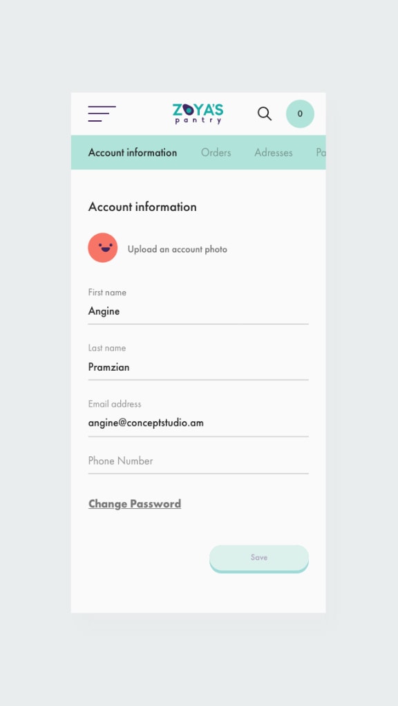
the result
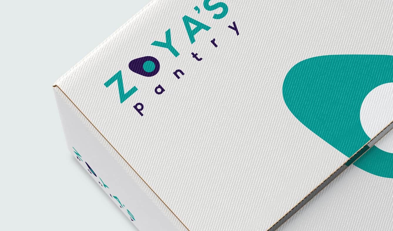
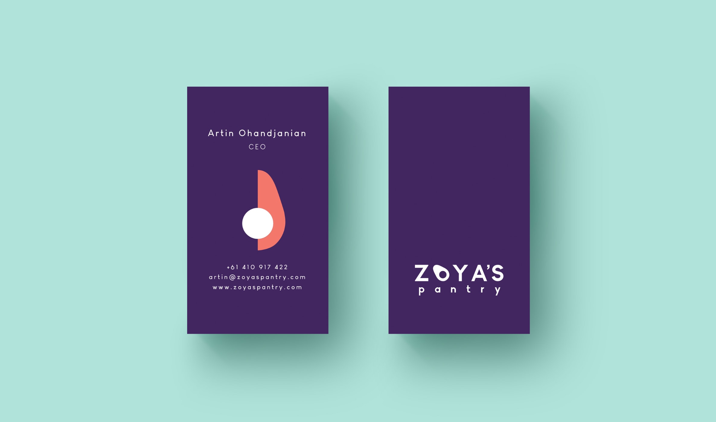
As Zoya’s Pantry uses organic products and healthy ingredients, we tried to create a brand identity and ecommerce website in a way for the user to be surrounded by a great variety of healthy products. We paid attention to make every small detail look perfect from the color to the animation. Although being an e-commerce website, we implemented various micro-interactions making sure that the users will enjoy their shopping experience with a very user-friendly website.Our goal was to break the stereotype that ecommerce websites should be user friendly but plain and boring at the same time. That's why we created a super convenient user experience and at the same time enriched the website with little elements that will follow the user throughout the shopping experience. Our goal was to break the stereotype that ecommerce websites should be user-friendly but plain and boring at the same time. We created a super convenient user experience and at the same time enriched the website with little elements that follow a user throughout the shopping experience.
awards
Honorable Mention - awwwards
team
Angine, Creative Director
Hovig, Art Director
Armen, Account Manager
Mariam, Graphic Designer
Narek, Interactive Designer
Hrach, Development Team Lead
Mher, Back-end Developer
Armen, Front-end Developer
Styop, Front-end Developer

