TAG - Extra Virgin Olive Oil
category /
Brand experience
client /
TAG EVOO
deliverables /
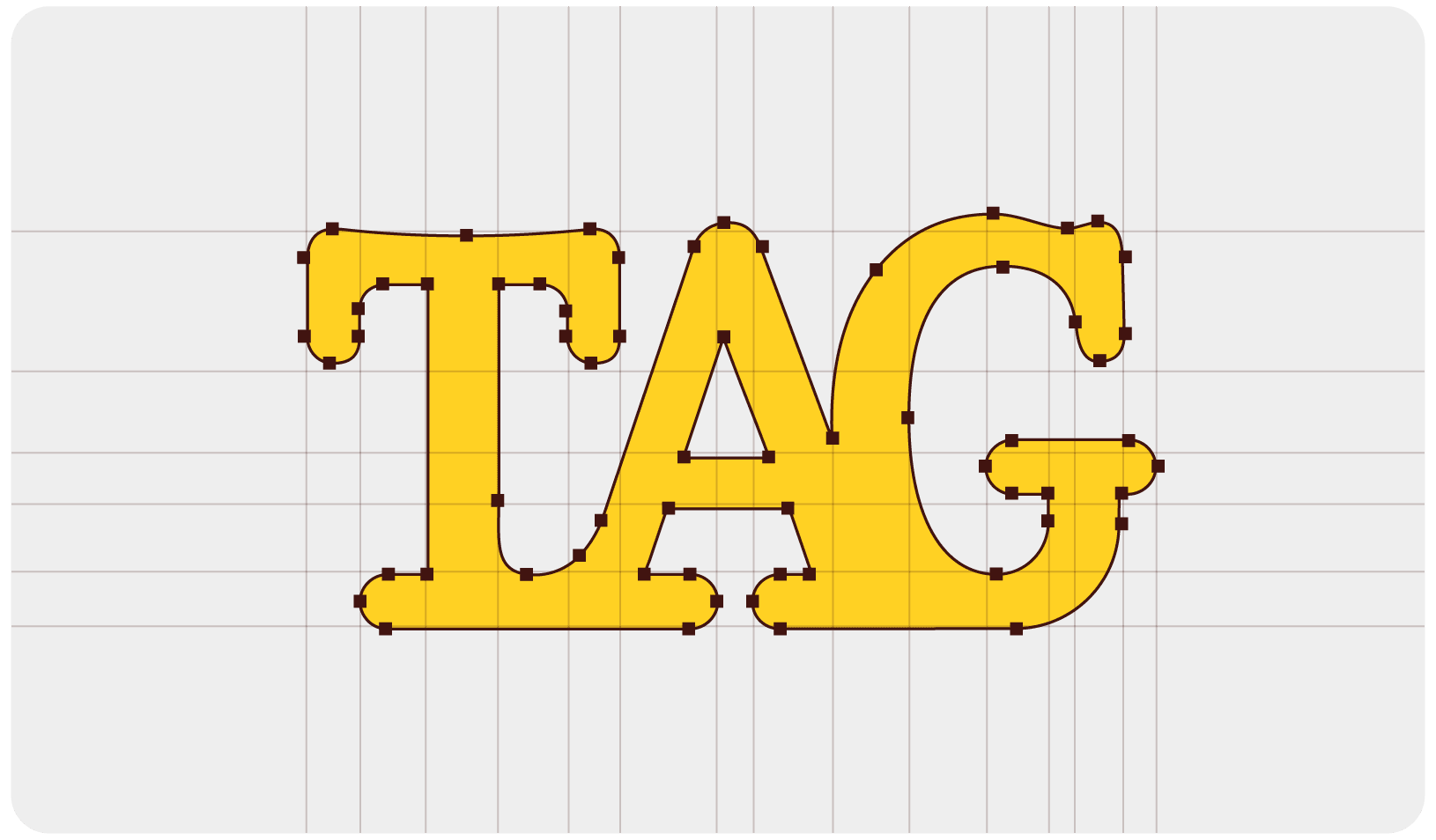
Visual Identity
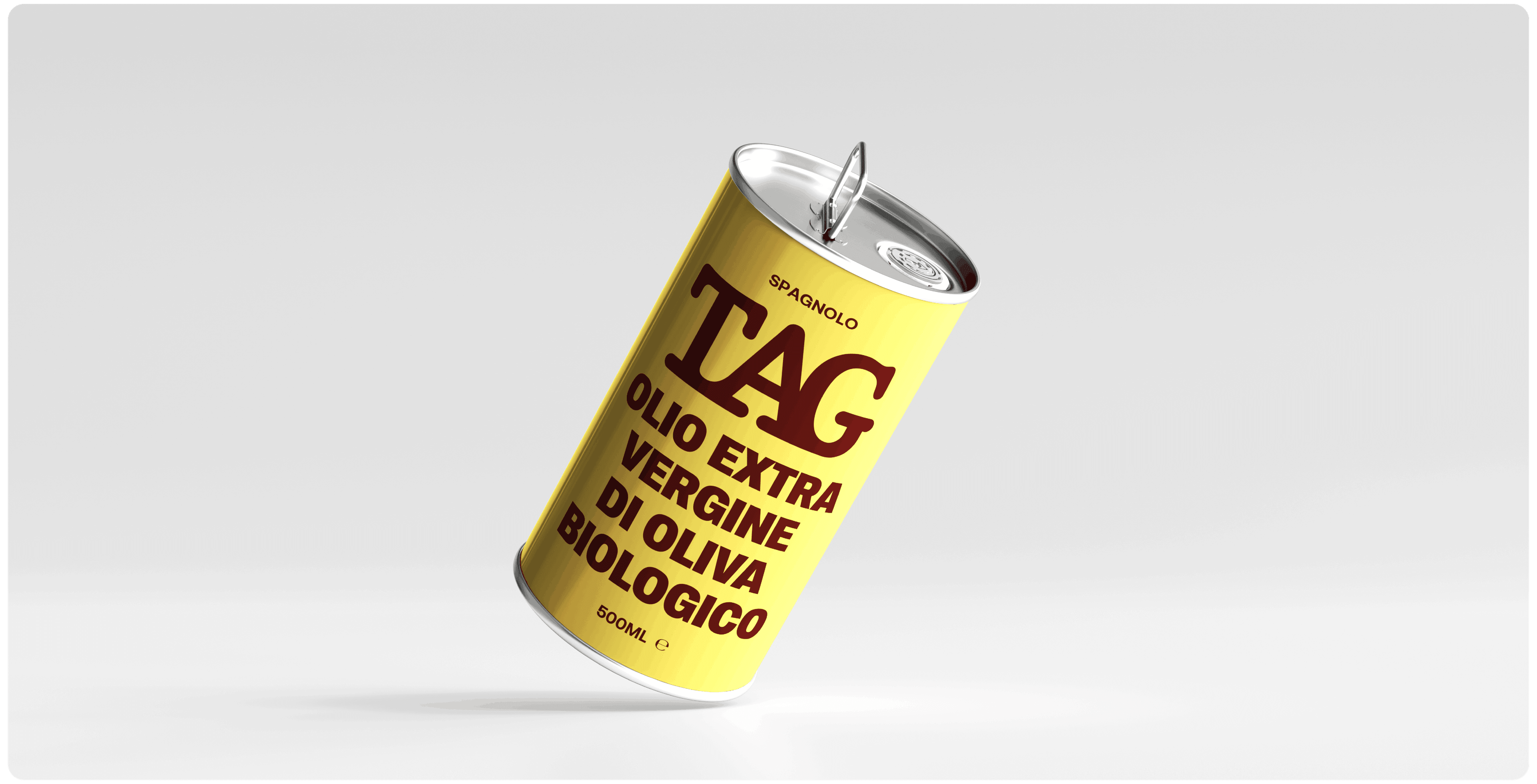
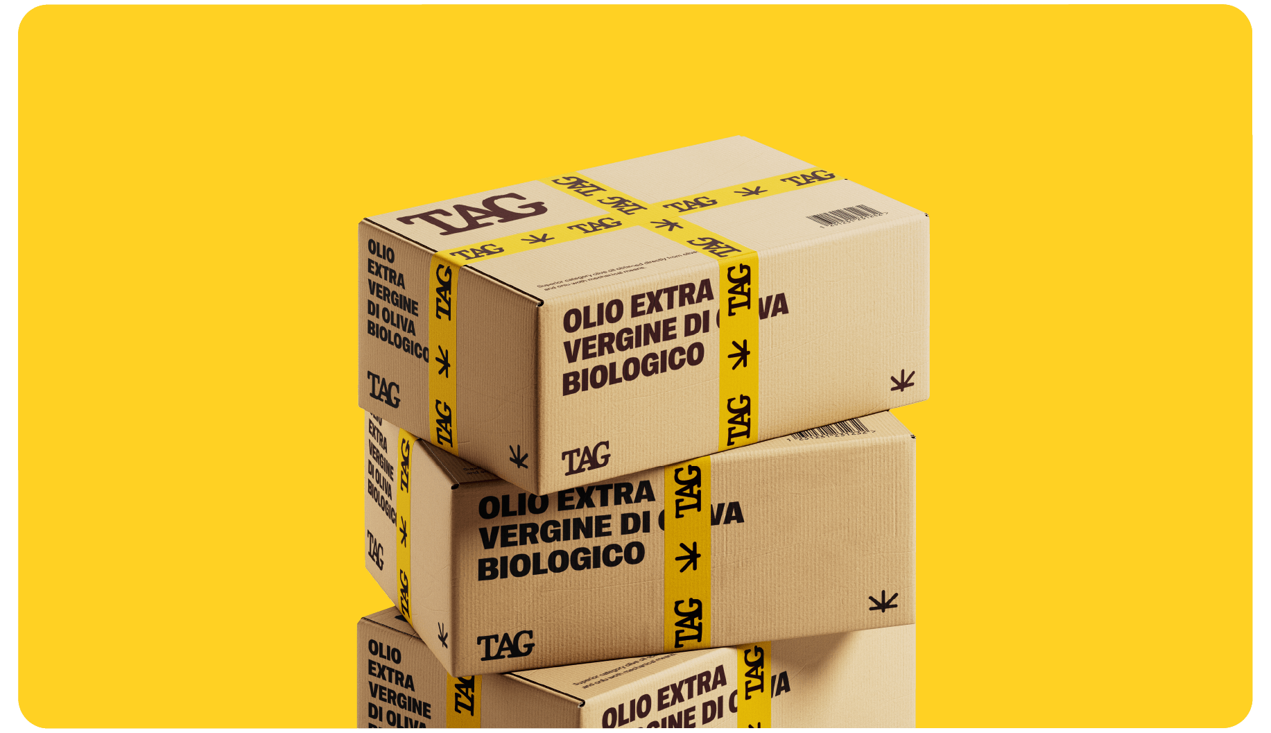
Packaging
Logo design
Animation
about the project
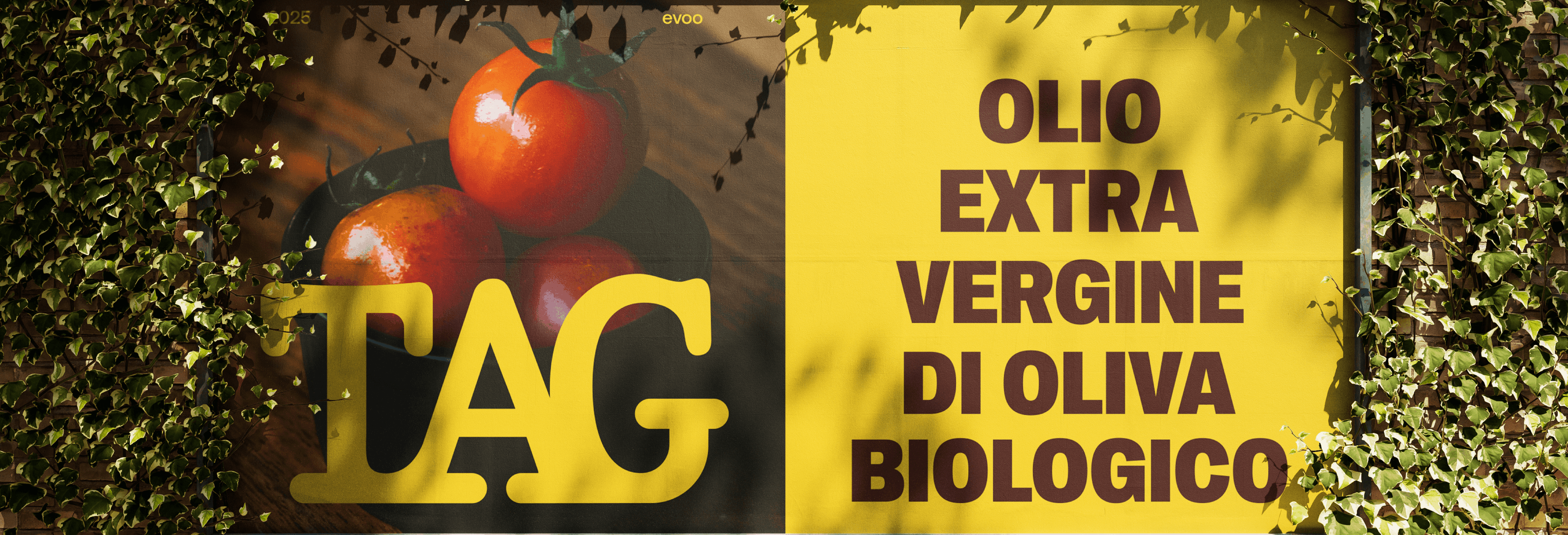
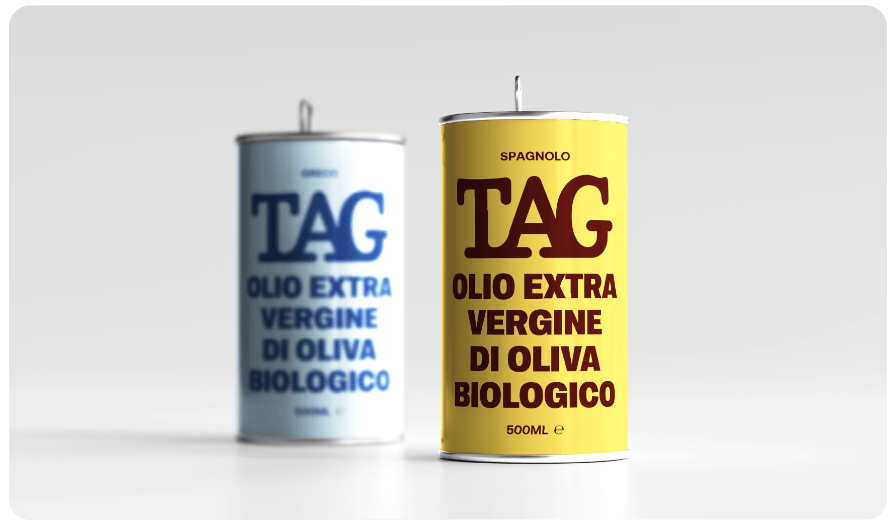
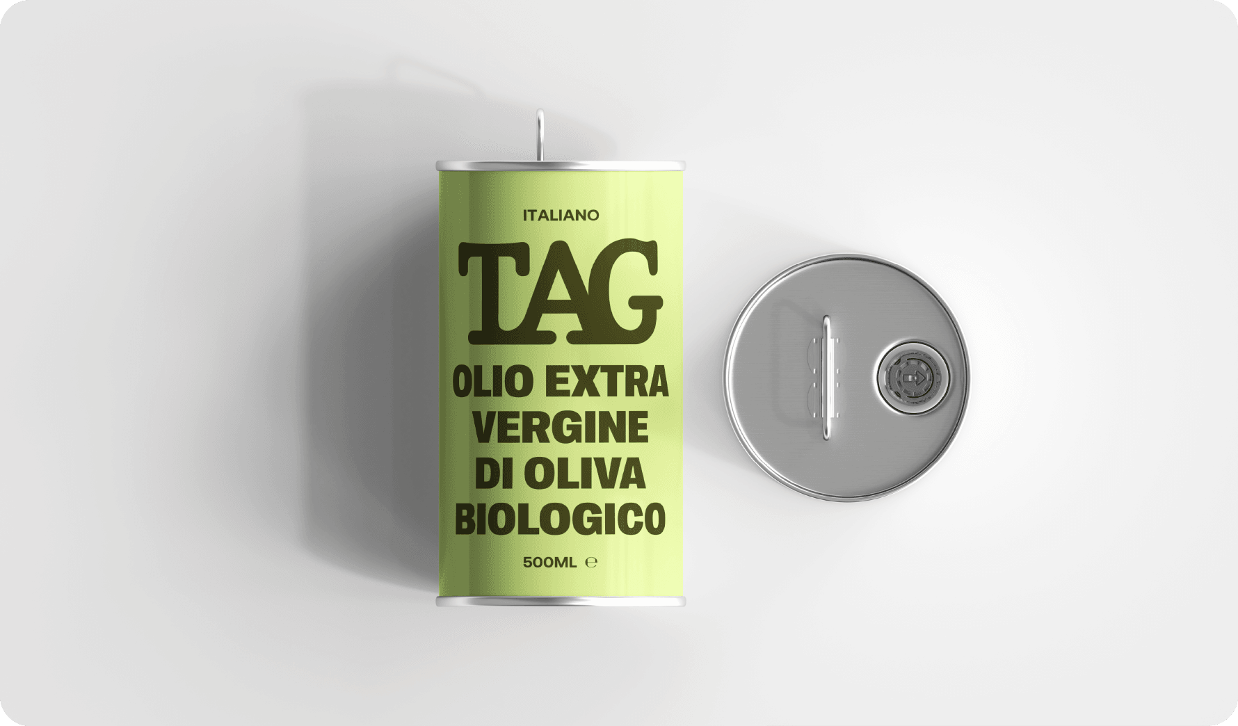
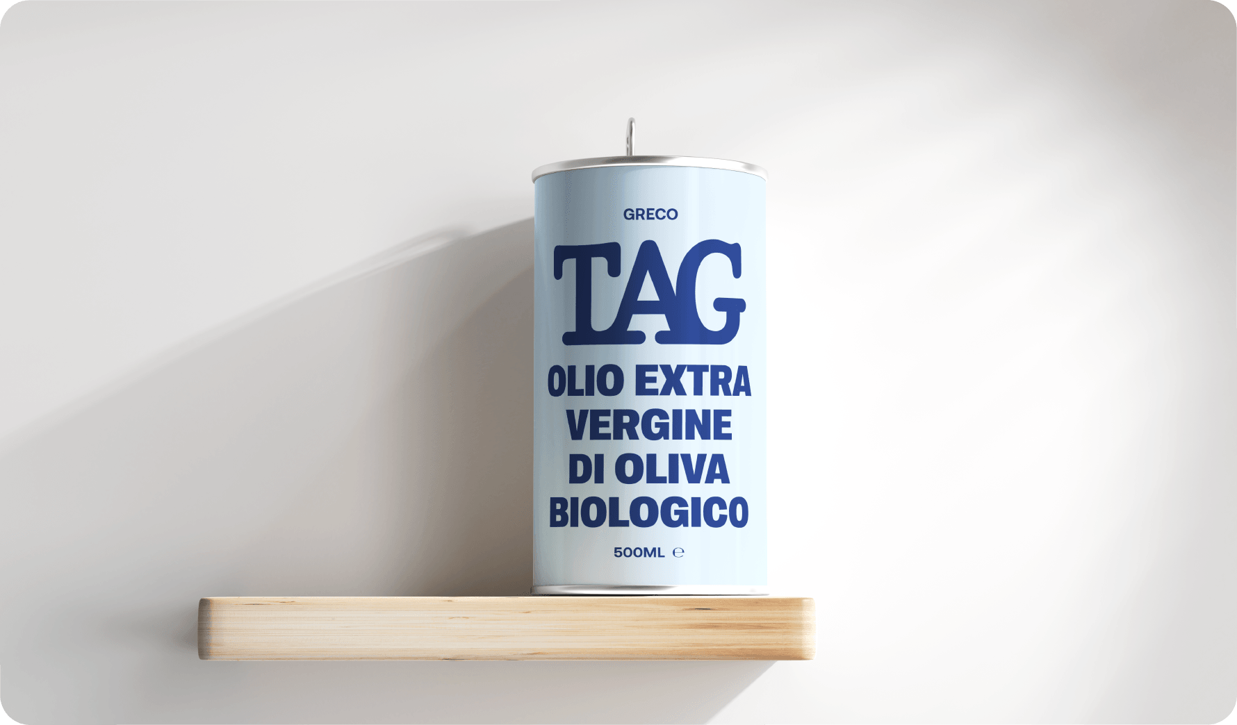
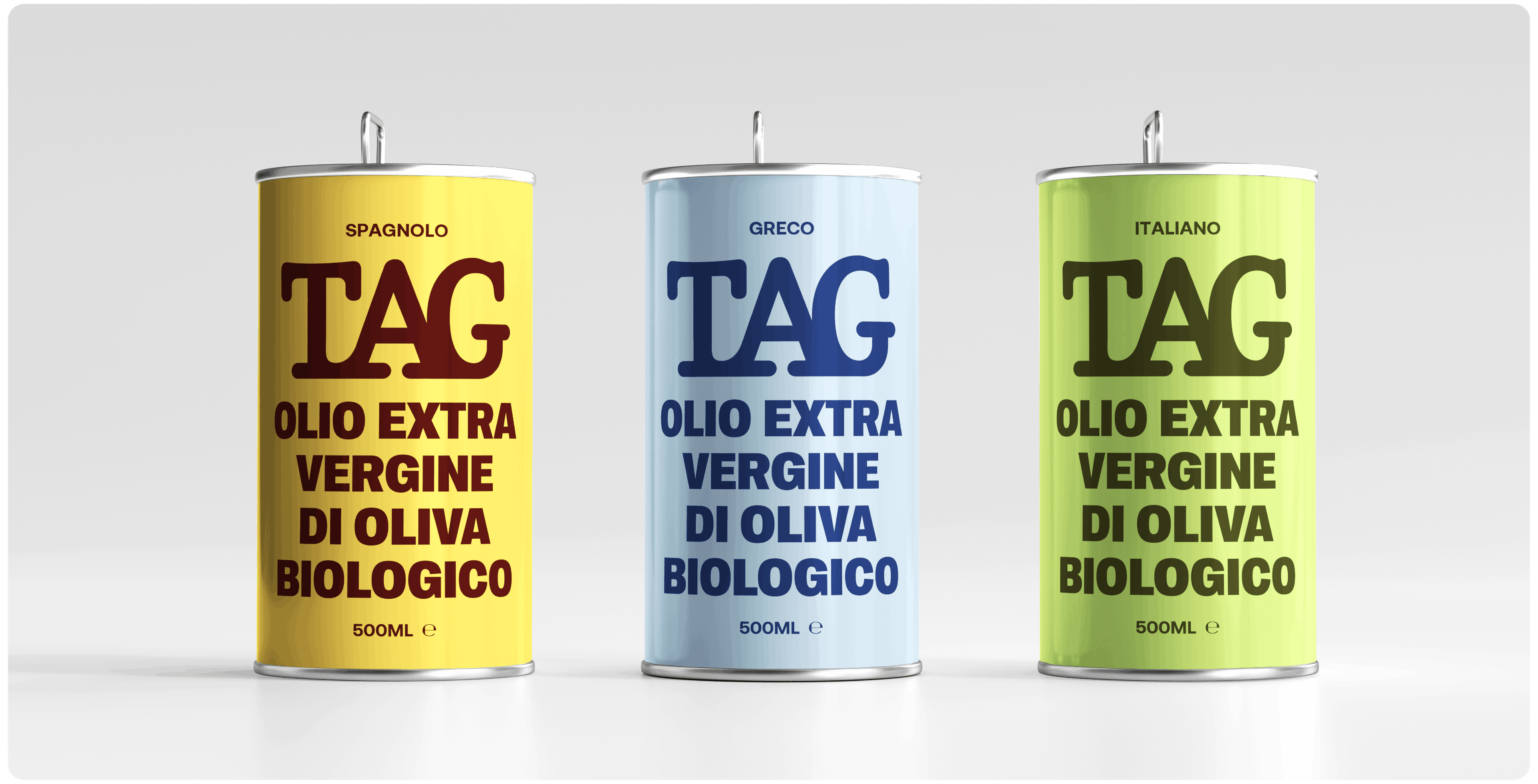
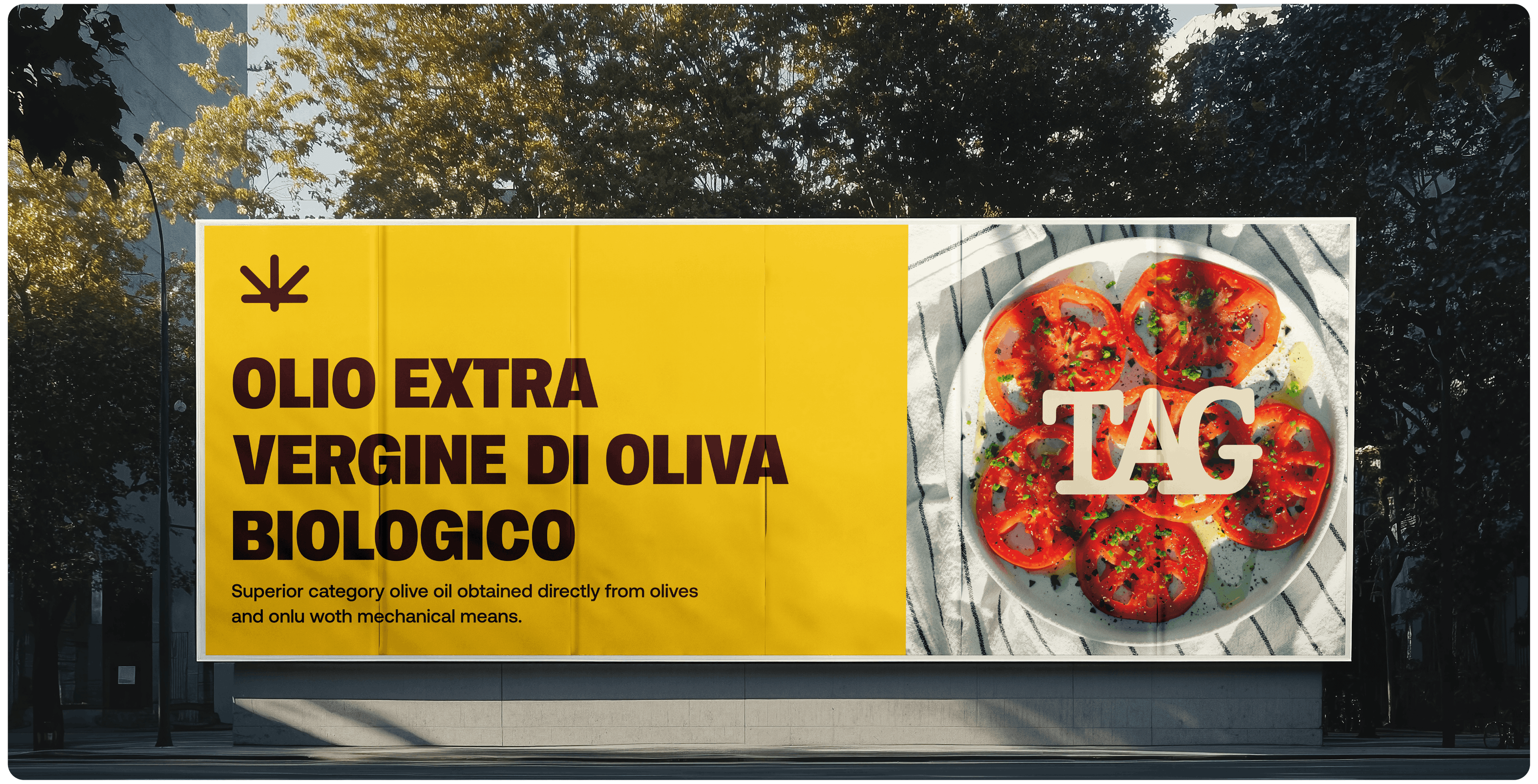
TAG came to us as a quality product with no visual language to match. One of the most cluttered categories on the shelf, zero brand presence to speak of. We started from scratch. Identity, packaging system, color strategy — built from the ground up around a name that's short, punchy, and leaves room for the design to do the talking.
the result
The direction we landed on was deliberately minimal and unapologetically bold: high-contrast color, clean type, a visual presence that communicates quality before anyone reads a single word. The kind of packaging that doesn't shout. Just gets noticed.
team
Anginé Pramzian, Creative Director
Samvel Vanyan, Account Manager
Gor Muradyan, Graphic Designer

